Principles Of Design
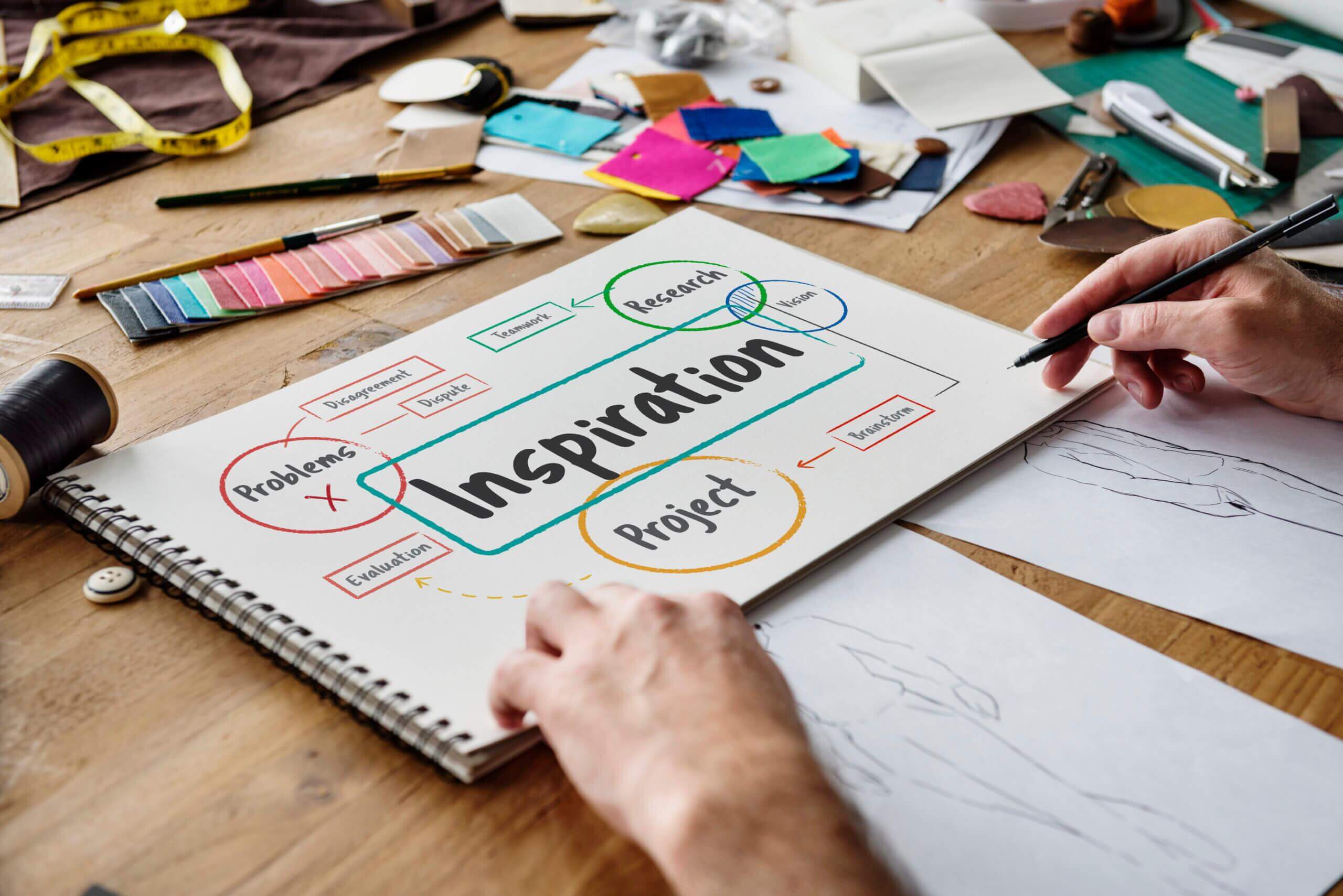
Table of Contents
Principles Of Design
Principles of design guide the ways in which design elements may be used. While the elements form the basic vocabulary of visual design, the principles constitute its broader structural aspects. In other words, the principles establish the relationships among the elements used in the design and organize their placement in the composition. They are the tenets used by designers to organize the elements of design in all visual design fields such as graphic design, product design including fashion design, industrial design, architecture and even fine art. A designer incorporates the use of elements and principles to create desired results for successful design.
There principles of design vary with different approaches to modern design among different schools of design thinking and individual design practitioners. These principles are not rigid but may be directed by intent. The designer’s purpose and creative vision drives the decisions in order to achieve appropriate scale, good proportion as well as harmony among the elements. The concepts of elements and principles drive all intentional design strategies. Therefore, the awareness of the elements and principles of design is the first step to create aesthetic and visually pleasing garments.
Principles Of Design Are Categorized Under Five Components:
-
- Balance
- Proportion
- Rhythm
- Emphasis
- Harmony
-
Balance
Balance is a state of equilibrium between different visual aspects of a composition. In other words, the visual elements need to be balanced in order to make a design look stable. While some elements may be the focal point which attract the eye, the concentration is not on one area to subdue the other areas. Balance in design results from the distribution of the elements of color, texture and space so as to maintain equilibrium between the visual weights of different parts of the garment design. A designer can achieve this balance in three ways:
-
- Symmetrical Balance.
- Asymmetrical Balance.
- Radial Balance.
1- Symmetrical [Formal] Balance: Symmetrical balance, also known as formal balance, is a mirror image balance. As in nature, the average human body is also visually symmetrical. Symmetrical balance in design is achieved when the elements are equal in visual weight and composition on either side of a vertical or horizontal axis. This implies that the focus of interest is visually balanced on both sides to keep the viewers engaged with the composition or design. Formal balance tends to be dignified though it is also static.
2- Asymmetrical [Informal] Balance: Asymmetrical balance, also known as informal balance, is achieved when the elements of design on both sides of the axis are not identical; yet they are arranged so that there is a sense of balance. The varying elements on both sides of a visible or implied division makes asymmetrical balance more complicated and difficult to achieve than symmetrical balance. Although as the name suggests that informal balance may be less planned, it is actually more challenging for the designer to plan the space to create visually appealing design. Every part of a designed product or garment has visual weight which requires stability. Balance may be altered by adjusting the size, visual weight, density and distance of the constituent parts from the central axis. The components of the garment form a visual balance with the application of color, value, shape, texture, position and design elements such as pockets, seams, gathers and so on. These guide the viewer’s eye to comprehend and appreciate the aesthetics of the harmonious design of the item of clothing.
-
- By Position: The placement of two elements of different sizes can create balance by position. A larger element in the central position can be balanced by a smaller element.
- By Color: Our eyes are attracted to colors. Vibrant colors can be used in smaller quantity to balance out the larger areas of neutral colors.
- By Value: Value is depicted with the darkness or lightness of objects. Black against white creates a stronger contrast than gray against white. To create a balance between the two, a larger spread of gray is required against the stronger value of black.
- By Shape: Larger areas/spaces with minimal detail can be balanced by smaller, irregular spaces with intricate details, placed off-center. Achieving symmetrical balance is difficult as it requires more evolved sense of design aesthetics.
- By Texture: Smaller areas with interesting and intricate textures can balance larger areas with smooth, untextured surfaces.
- By Eye Direction: Elements may be arranged in a way with details of shapes, colors and style details which can balance a heavier side by guiding the eye to follow a certain direction towards the lighter side by altering its visual importance. This effect can also be attained by outlining an object or with directional lines. For example, the same color on opposite sides of an image can cause the eye to be led from one side to the other.
3- Radial Balance: The third type of balance is Radial balance. This is the arrangement of elements and spaces around a central point where all the elements radiate out from a central point in a circular manner. This is attained the focal point leads the eyes towards the center. A wheel with spokes is an example of radial balance.
-
Proportion
Proportion is the representation of the relative size and scale of the various elements in a design. It is the relationship of various parts to each other and to the whole shape. Proportion is determined by distance, size and degree. It plays an important role in art, architecture, textile and clothing. All designs are seen in the context of proportion of the human body.
The Golden Mean, also known as the Golden Ratio, was developed in the western world and based on the mathematical ratio that was found to occur in nature as well as in the human face and body. The Golden Mean can be applied to geometric shapes through multiplication in the ratio of 1:1.618 and by making a logarithmic spiral known as the Golden Spiral. When applied to design, the Golden Ratio creates compositions that are aesthetically pleasing through harmonious and balanced proportion.
-
Rhythm
Rhythm refers to the patterned repetition, recurrence and organized movement of the elements. Visual rhythm is achieved by means of repetition, progression and radiation. Any changes in the hue, value or chroma of color in a recognizable pattern, is also an expression of rhythm. Space may have different rhythms. The rhythmic effect becomes stronger when a pattern is repeated; any change in rhythm causes visual disruption. Rhythm reinforces the functional, structural and decorative aspects of garment. It has communicative ability that enables easier comprehension of the viewers through its visual beat. Visual rhythm is the regularity and continuity that smoothly guides the eye from one detail to another until the entire composition is viewed.
The rhythm in the wall paper pattern is created by wavy lines in a two-dimensional composition. A similar rhythm takes the form of a design feature on the skirt where the straight lines are actually pleats. Rhythm can be achieved in three ways:
-
- Repetition.
- Gradation.
- Radiation.
1- Repetition: Rhythm can be achieved through repetition. This means that the same or similar elements can be used more than once in the design. Repetition of certain design elements such as line, shape, space, value, color and texture can cause a sense of unity, consistency and cohesiveness. Repetition with variation is interesting; repetition without variation can be monotonous. There are two types of repetition:
Regular Repetition: Regular repetition occurs when the elements or the interval pattern between the elements are similar in size, length, or in other aspects. Generally, both the interval as well as the elements of design such as line, shape, texture or space remain similar and consistent throughout the design, though one or more of these elements could vary. The rhythm of regular repetition could appear monotonous if there is no variety to break the repetitiveness. Nonetheless, a repeat pattern can be made less monotonous by incorporating elements of interest that break the regularity. To add interest to a monotonous pattern, you can vary the interval [space], which changes the pace of the rhythm.
Irregular Repetition: Irregular repetition occurs when there are variations in the repeats in terms of the elements of design and the spacing. If the repeating elements do not have specific or regular intervals, the uncertainty in the design creates random rhythms. This focuses attention on the central core as well as the outward lines and edges.
Repetition In Garments
The principle of repetition is applied to garments too. Just as the human body is symmetrical, the garment too would normally have features that may be repeated. The sleeves, collar, trouser hems and other details are often similar and convey a sense of symmetry. However, asymmetrical design features may be built in to create newness. The principle of repetition is applied to a garment by adding symmetrical design features such as layers of equal length in the skirt and the formation of pleats in the skirt respectively.
2- Gradation: Gradation occurs in design in a similar way as repetition, so as to emphasize the gradual change in the elements of design such as line, shape, space, value and color. The components are generally identical except for a minor change with each repetition in increasing or decreasing order. Unlike the principle of contrast which emphasizes unexpected or visually strong changes in the elements, gradation refers to a gradual change in the elements. This includes change in linear perspective caused by the gradation of size and direction. Gradation of color from warm to cool, and values of tints and tones from dark to light can produce the perspective of depth. Gradation can guide the eye to move along a shape in a certain direction and is therefore used to emphasize the design.
Gradation In Garments
The patterns of lines in the dress are graded from thick to thin creating depth and movement which adds interest to the silhouette of the garment. Tonal gradation in the skirt can be achieved by patterns on the fabrics, varied density of fabrics or layering of the fabric in tiers. It conveys an impression of increased density on the top layer and reduced density in the subsequent layers.
3- Radiation: The third type of balance is Radial balance. This is the arrangement of elements and spaces around a central point where all the elements radiate outwards from a central point. The movement is known as radiation. This is easy to achieve as there is a focal point which leads the eyes towards the center. Radiation is limited in use to lines, space and shape. A wheel with spokes is an example of radial balance.
The principle of radiation is demonstrated by the lines moving outward from a central focus. The center creates an area of interest and as the lines move towards the periphery of the frame creating dynamic movement.
Radiation In Garments
In a garment, the placement of details needs to be considered carefully. Radiating lines can create the illusion of enlarging effects or slimming effects, which if placed on the wrong part of the body, can be very unflattering.
Radiation works best when used in limitation and against a simple background. It is mostly used in draped and clinging designs because the folds drawn into a cluster that mould well to the shape of the body. Used in this way the radiation would be the dominant feature of the design. Radiating lines focus the attention and direct the eye towards the center which is further softened by the support of the yoke in the dress.
The folds of the skirt drape softly from the waist band of the skirt, drawing attention to the waist. Such features can be used cleverly to attract or divert focus from certain areas on the body. For instance, for a figure type which is heavy at the waist, the garment style could feature radiating lines at the neckline or sleeves to deflect the focus away from the waist. On the other hand, if the figure type has a trim waistline, then the design feature can include radiating lines at the waist.
-
Emphasis
Emphasis is a strategy where the purpose is to draw the viewer’s attention to a specific design element. Emphasis therefore, is the component that is the focal point that demands the most attention from the viewer. For an element, form or space to be portrayed as the focal point in a composition or design, it must be made strongly visible. Rhythm and movement may guide the eye around the design but ultimately, it will return to the focal point of emphasis. Emphasis can be achieved in design by placing the element in a precise position where it distinctly stands out by using the other principles such as asymmetrical balance, contrast, isolation, and movement also.
As emphasis is an effective tool to attract the attention of the viewer, the designer needs to leverage the knowledge of this principle. Two important aspects of emphasis are Dominance and Subordination.
Dominance: Dominance creates interest in the design or composition by counteracting confusing aspects. In other words, dominance can be applied to one or more of the elements to create emphasis on that which is more important or more noticeable than its surroundings. It becomes the focal point of interest of the composition supported by other features in the design. It can control the attention of the viewer to determine what will be noticed first, what is dominant in an image, and its direction to the next step. A well-designed garment has a single strong feature which becomes the focus or dominating detail. This detail can be structural such as a pocket, placket, yoke, or visual such as shape, texture or color. The dominant black edged detail on the Chanel suit draws attention. The white handbag with the Chanel logo in black color stands out on the basis of this principle.
Dominant qualities advance visually because they are more noticeable. Sharp, thick lines dominate delicate thin lines, shiny textures dominate matte textures, and brighter colors are more noticeable than muted colors. Other details can be “played down“ in order to supplement and re-enforce the dominant feature. Any feature which does not make significant, positive contribution to the design should be omitted.
Subordination: When there is dominance there must also be subordination. Subordination is defined as minimizing or toning down other elements of a composition in order to draw attention to the focal point. While some compositions have strong visual dominance that directs the viewer’s attention to the focus area, a subtle emphasis of other aspects leads the eye to a secondary focus point. The designer should be able to use different components or details to attract and retain the viewer’s attention. This includes design details that may not be noticed at a glance but are gradually detected with delight.
There Are Three Main Ways To Create Emphasis In Design:
-
- Contrast.
- Placement
- Isolation.
1- Contrast: Contrast refers to the difference that distinguishes an object or an image from other objects and the background. It is an important design principle that shows which parts of the design are more important and then guides the eye to focus on those aspects. Contrast creates visual tension in a design and breaks the monotony when a component is repetitive. It does so by the juxtaposition of opposing elements e.g. angular and curvilinear, large and tiny, complementary colors on the color wheel e.g. red with green, blue with orange, yellow with violet and so on. Contrast may be in terms of the tone or value e.g. light/dark, or there may be contrast in direction e.g. horizontal/vertical.
The focus of contrast in any design needs to be located at the center of interest. The principle of contrast draws attention to the visual differences. Too much contrast scattered across the composition may disrupt unity. Therefore, unless a design is aimed to purposefully create feeling of chaos, it is important to carefully plan where the designer would like to place maximum contrast. Any interesting design uses contrast elements such as diversity of shapes and sizes.
The effect of contrast utilizes various elements to achieve a dramatic yet balanced effect. The careful placement of contrasting details in a garment is necessary to avoid drawing attention to those parts which are not the focus. Fashion designer Yves Saint Laurent’s “Mondrian Dress” inspired by artist Piet Mondrian, has thick black dividing lines against a white background filled with asymmetrical blocks of color that contrast with each other and yet are balanced. The striking visual appeal has made it an iconic dress in fashion history. It is important to learn to determine the amount of contrast before applying it, failing which the effect may either not appeal to the aesthetic sensibilities, or else not emphasize anything at all. Contrast can be achieved in different ways – color, size, and shape.
Color Contrast: Color is used extensively for this purpose. One of the most prominent contrasts is the difference between black and white. The contrast in value of colors also affects the visual impact e.g. bright colors attract more attention than neutral, dull or dark colors. To grab instant attention, you can use a strong value contrast e.g. the use of bright color against a dull background.
Size Contrast: Each attribute in design whether small or large, dark or light, is a relative measurement on some scale. Just as each quality exists in contrast to the other, the contrast in size is also relative and takes place on a scale. Bigger and bolder elements are more noticeable than smaller and subtle elements. The reason is that the larger size of the main detail draws the viewer in and emphasizes its significance over the other details.
Shape Contrast: Shape can create contrast but may not be as strong element as size or color. One way to make details noticeable is by creating difference in their physical shape as compared to other details e.g. square buttons on a polka dotted blouse.
2- Placement: The central focus of a composition is the typically placed at the strongest location for emphasis. The further from this location that an element is placed, the less likely it is to be noticed first. Placement of a garment detail can enhance the design and attract the eye. The position where the garment detail is placed in relation to each other, can affect the emphasis.
The most important point of emphasis in the format of a composition is at the center; therefore, anything placed in this dominant position is likely to be noticed first. The further from the center, the less noticeable a detail becomes. Once the primary focal point is established, proximity, similarity and continuance can be used to ensure that the specific element or detail is noticed. Proximity with the primary detail in focus through overlapping or touching, emphasizes the successive focal accent. The more visible an object is, in terms of contrast, the likelier it is to be noticed. Therefore, it is important to place details and elements in the most effective positions.
When making an image through collage technique, try different placements of the visuals to achieve the desired effect before gluing them.
Similarity an object that has the same color, texture, size and shape will form a group with the primary object and be noticed successively. The more alike the two objects are, stronger is the link.
Continuance can guide movement by directing the viewer’s attention to the secondary object or detail by ensuring that the primary object or detail points at or faces it.
3- Isolation: In a composition the position of an object in relation to other objects, can affect the emphasis. Isolation is a mode of emphasis that attracts attention when a detail or an object is placed separately from its surroundings or from the group. It draws the eye because the detail is not unified/merged with the rest.
-
Harmony
Harmony is the visually satisfying effect of combining similar, related or contrast elements. A design is said to be harmonious when one or more qualities of a design are alike. These similar features are repeated throughout the design to create a feeling of consistency. Harmony results when adjacent colors on the color wheel e.g. red and orange are used. Different combinations of color and shapes that are in contrast to each other can also be harmonious. The principle of harmony involves the careful combination of design elements that share common characteristics such as shape, texture, color and other design elements.
Harmony In Garments
Shapes created in terms of pockets, collars and cuffs will harmonize if they are soft and curved, or straight and angular according to the main form of the garment. Contrasting elements or complimentary colors can also harmonize when an intermediate element is used e.g. in a composition with red and green, the introduction of brown which is a combination of red and green can be harmonious. The same principle would apply to other elements. To achieve harmony in a garment design, the three aspects of functionality, structure and decoration need to be synergized with each other. This means that the gender, age, personal coloring, size, lifestyle and season would need to be considered.
The ensemble has a harmonious interplay of color and pattern. The jacket and skirt suit in gray derived from the combination of black and white, is teamed with an overcoat in black and white houndstooth pattern which is the highlight of the ensemble. The styling with accessories reflects and reinforces harmony.
Related Posts
Fashion Design: Functions Of Clothing
Fashion Design: Indian Clothing In First Half Of The 20th Century
Fashion Design: Indian Fashion In The Second Half Of The 20th Century
Fashion Concepts
Fashion Design – Fashion Changes And Cycle


